Home > Latest News > How working in close partnership leads to client satisfaction.
How working in close partnership leads to client satisfaction.
Working in close partnership led to client satisfaction for Edenred, who are a leading incentive company. They offer employee engagement solutions to 830,000 corporate clients around the world, and their services are used by 47 million employees globally, channelling rewards and benefits from 1.7 partner merchants.
Edenred UK approached Toast to create their new brochure, with the purpose of promoting and demonstrating their full range of employer services and technical solutions. The brief included an in-depth brand manual to follow, plus some clear guidance on other requirements, including:
- A preferred format of 210mm x 210mm square
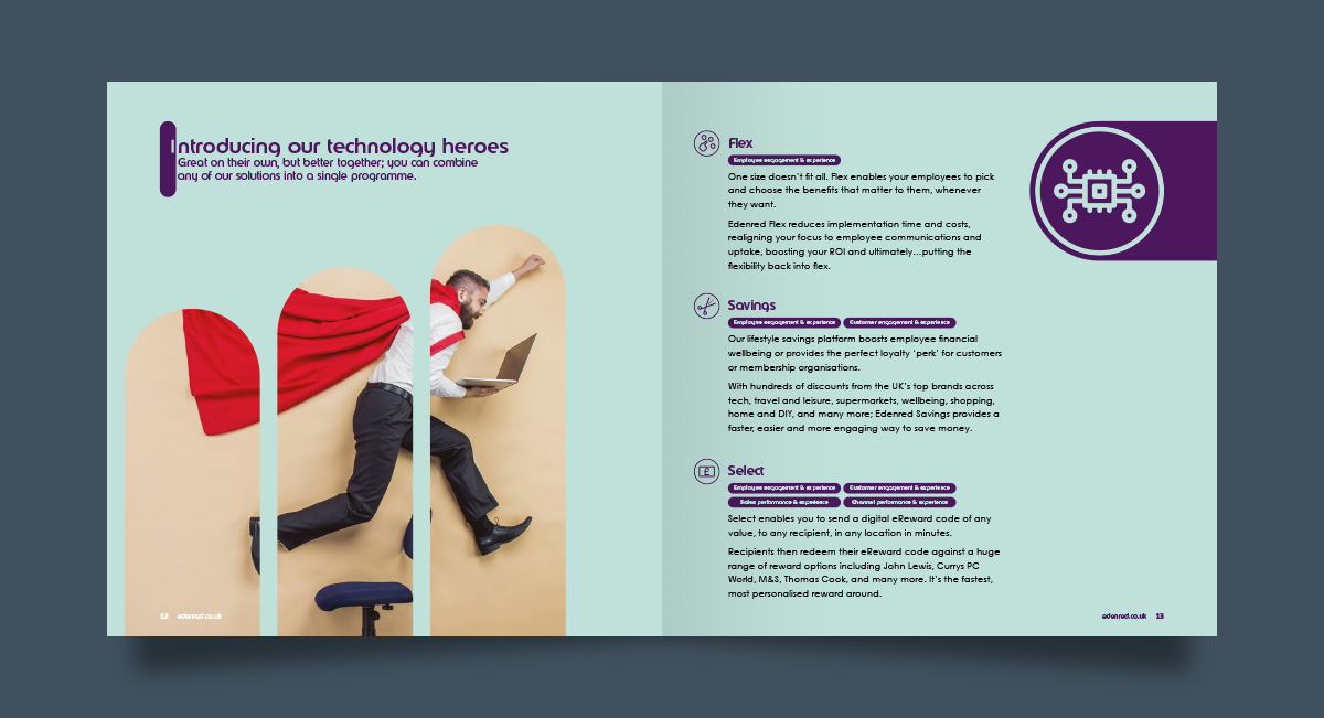
- Photography-led imagery, with some infographics to illustrate facts and figures
- Open, fun and friendly – a more approachable and informal look compared to other documents in the corporate publications suite.

The brand manual included the expected corporate colour, typeface and logo guidance, but there were a couple of important additional requirements too. These called for a careful, considered approach to the design, and it was clear that full attention to detail was needed to get these right.

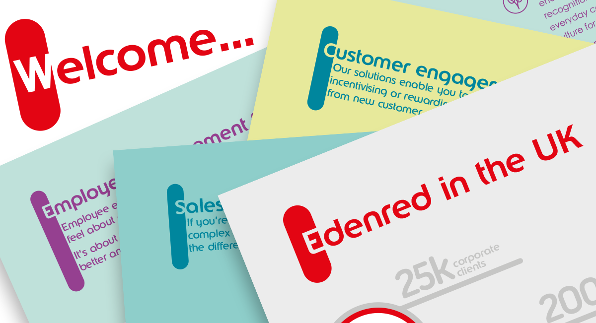
Drop capitals in a ribbon.
The first unusual requirement was applying Edenred’s bespoke drop capitals in leading paragraphs. These drop capitals are made up of an initial letter reversed out of a ‘ribbon’ graphic element. The brand guidelines go into detail on appropriate type sizes and the depth and width of the ribbon relative to the paragraph and other page elements. It’s an eye-catching and well thought-out design element – but it meant that an important part of this project was making sure we applied it consistently throughout the brochure.

Bespoke pictograms.
The second design element we needed to pay attention to were Edenred’s pictograms, used to highlight key points in the text. Again, the brand guide offers clear instructions on how these are put together, but unlike the 26 letters used for the drop capitals, the number of possible pictograms is limitless – so we were required to create these specially for the brochure. We designed over 30 pictograms for Edenred UK, always adhering closely to the style guidelines to maintain the established look.
Imagery.
The brief included a need for infographics to visually represent the numbers and facts. It made sense to link the look and feel of these infographics to the pictograms. The client also gave us a clear idea of the look of the photos to be used; they should show workplaces with diverse employees, but presented in a quirky, fun and colourful way. Definitely not corporate, clichéd or boring!
Bringing it together.
The brief was therefore fairly focussed from the off, but this doesn’t mean there was no scope for creativity and flair. There was enough wriggle room to make it worthwhile producing a first round of visuals to tie down the layout. These were sketched designs, presented with some sample photography.
Following client feedback on this first round, we finalised the sample spread’s layout, typography and design; and this formed the basis of the master pages we used to take the design through to finished print-ready artwork.
The client had detailed feedback at every stage of the process, making for a highly collaborative workflow which benefited the entire project. And the end result? Well, the close partnership client satisfaction resulted in the client saying: “Thanks very much – really pleased with it and I’ve had some great feedback!”
If you need help with your brochure design get in touch with Toast today.

