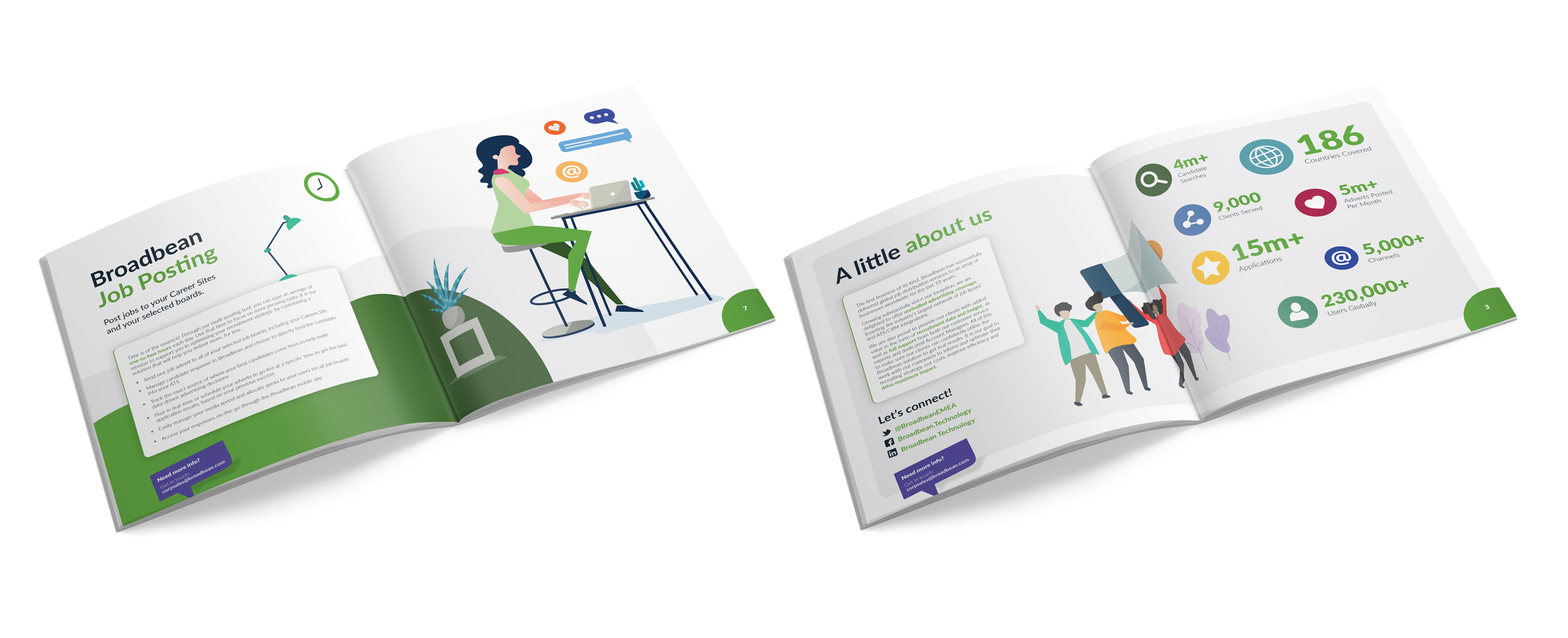
White space is your friend.
We take a look at white space and why designers like it.
Sometimes when we’re working (on a brochure or advert for instance) the client notices some white space on the page and feel they need to fill it with something. In their eyes this is wasted space that could be used to insert more information. Toast always advises its clients to be clever with how they use white space and avoid the temptation to fill it or not value it. When this happens we have to explain to them: White space is their friend.

What is white space?
White space (or negative space) is the area around any text or images that appear within a design. It forms an integral part of a layout because it provides balance. This space doesn’t have to be white, it could be a colour, background image or texture.
Having too much content on a page makes it hard to read because the viewer doesn’t know where to look. This affects elements such as callout boxes, which can lose impact and become lost when there’s no space around them to ‘breathe’. On the other hand, having too much white space makes the page look empty. So getting the balance right can be tricky at times, but it’s important.
Types of white space.
There are two types of white space – these are:
- Active White Space – This is the space that a designer will make a conscious effort to add to a design layout for emphasis and structure. Active white space is often asymmetrical, which makes the design more look more dynamic.
- Passive White Space – This is the white space that occurs naturally, such as the area between words on a line or the space surrounding a logo or graphical element.

Benefits of white space.
The main benefits of white space are:
- It makes content easier to read
- It’s a visual tool to separate different elements such as paragraphs of text or images
- It places more emphasis on certain elements such as call outs or titles
- It creates balance
- It enhances the visual appearance and style.

Trust the designer.
So before you ask your designer to fill that gap you see on the page of the brochure or an exhibition design with some more information, think: do you really need to include this? Are you filling it just for the sake of it? A good designer will let you know and should advise against it if it has a negative effect on the layout, or clouds the main message.

Get a quote for your next project.
If you’d like us to provide a quote for your project, just complete the form and we’ll get in touch.

